
Barbershop Walkin Manager
Summary
My Role
UX UI Designer
Product
Walkin Manager (On-premise Barbershop Management Software)
Project Background
The Walkin Manager is a customer queue management system which allows barbers to manage their walk in (non-appointment) customers from arrival through to checkout.
The Problem
A large corporate customer was considering using the existing software solution, and conducted usability testing to see if the product was a good fit for them. Significant usability issues were found; the corporate customer requested a redesign to improve the usability of the Walkin Manager before they would come on board.
The Solution
A UX redesign was needed to address the usability issues as part of the contract to get the corporate customer on board. A UI update was also needed to help modernise the product (within the limitations of the existing on-premise tech stack).
Users
Barbers
🎯 Outcomes
After the redesign, the large corporate customer agreed to use the new solution across 500 barbershop locations in the US.
Significant increase in recurring revenue for the software provider.
The product successfully passed usability testing after the redesign.
User feedback indicated “huge improvement to ease of use”.

Usability Issues Found in the Existing Product
Usability testing indicated some key areas for improvement in the existing product:
When asked to start the core workflow of “check in a customer”, users struggled & took a long time to find the “new” button.
Users noted that the button used to move a “waiting” customer to “in service” felt detached/too far away from the customer. It also required 2 clicks, which felt inefficient.
Users found that initiating the checkout/payment process for an “in service” customer was not intuitive, due to the flow requiring right to left movement across the screen. It also required 2 clicks, which felt inefficient.
Users took multiple attempts when asked to change their current status (e.g. available, away/on break, unavailable). This was primarily addressed as a separate project, however improved visibility of an employee’s current status was included as part of this project.
Users did not know how to drag and drop customers in the Walkin Manager. The grey tiles were not intuitive “drag and drop” indicators.
Below is an image of the existing product, before redesign:

Brainstorm & Rough Sketch of the Redesign
After reading the usability test results (provided by the corporate customer), and playing with the existing product to familiarise myself with it, I ran a brainstorm session with some key members of the product and dev team. During the brainstorm, we discussed ideas for how we might solve the usability issues and make the Walkin Manager more intuitive & easy to use. Based on the key ideas we discussed as a team, I drew up the below rough sketch to capture my plans for the redesign:

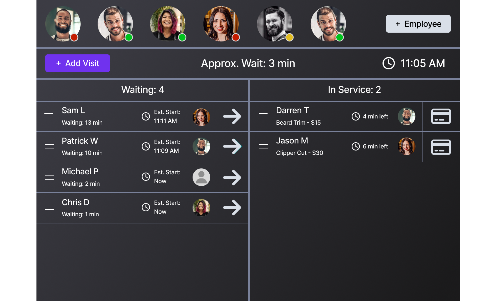
Summary of the Redesign
I created the below design using Sketch, with some assistance from my team lead who was more familiar with Sketch than I was at the time.
Here is a summary of the key changes I made to the design, to tackle the usability issues:
Employees moved to top of screen for consistency with other areas of the existing product
Changed the layout to create an intuitive left-to-right flow across the screen, to match the user’s natural eye-movement & expectation of how a customer moves through the barbershop journey from start to finish
Added clear visibility of current employee availability/status
Added modern drag handle icon to support intuitive drag and drop functionality
More prominent call to action button to let the user know where to start
Efficient, one-touch button to move a waiting customer to the in service list
Efficient, one-touch button to take an in service customer through to checkout/payment
Simplified the UI by reducing clutter & information overload
Modernised UI
Design Iteration based on User Feedback
I showcased the new design to a group of users during a design feedback session.
The feedback was overall very positive, indicating that the redesign was definitely on the right track for improved ease of use:
They loved the new employee status indicators, which were intuitive and reminiscent of other social media platforms they were already familiar with.
Liked that the new interface looked more modern & simple.
Loved the new one-tap action buttons, for improved efficiency.
Loved the prominent call to action for “Add Visit”, so they knew were to start their workflow.
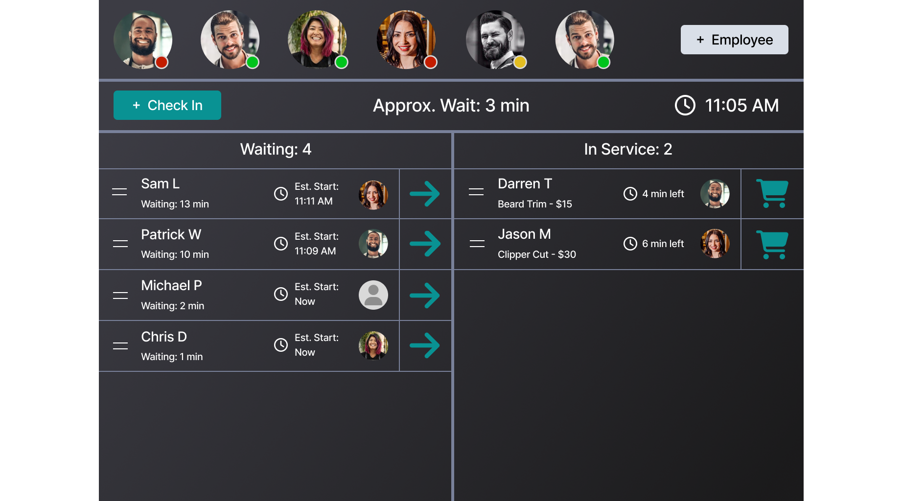
User feedback indicated that there was still some room for improvement though:
“Add Visit” wording doesn’t resonate > Users suggest “Check In” is the wording they would use.
Checkout button iconography unclear > Users unsure what the credit card icon is supposed to be > Users suggest that they usually associate a shopping cart with Checkout.
Grey colouring of the one-tap action buttons looks like the buttons are disabled/not clickable.
Based on the user feedback received, I made the following design updates:
Changed wording of “Add Visit” to “Check In”.
Checkout button > Changed the credit card icon to a shopping cart icon.
Changed the colour of the one-tap action buttons, to ensure it was clear that these buttons were clickable.
Final Usability Testing: Success! 🤩
Usability testing after the UX/UI redesign indicated that:
Users intuitively knew where to click to start the check in process.
Users were able to easily and efficiently move a waiting customer to in service.
Users were able to easily and efficiently initiate the checkout/payment process.
Users knew where click to change their current status (e.g. available, away/on break, unavailable) on their first attempt.
Users now understood how to drag and drop customers in the Walkin Manager using the drag handle icon.
The redesign had successfully addressed the usability issues that were found during initial testing! 🤩

🎯 Outcomes
After the redesign, the large corporate customer agreed to use the new solution across 500 barbershop locations in the US.
Significant increase in recurring revenue for the software provider.
The product successfully passed usability testing after the redesign.
User feedback indicated “huge improvement to ease of use”.
