
Pet Care Plan Sign Up
Summary
My Role
End-to-end UX UI Designer
Collaborated closely with Business Analyst
Product
Ascend (Cloud Veterinary Practice Management System)
Project Background
A “care plan” is a loyalty program subscription model for pet parents offered by vet clinics. Care plans provide a predictable revenue stream for vet clinics, as well as increased customer retention. Pets and pet parents are provided with benefits such as free consults, free annual vaccinations, discounts on pet food etc. as part of their care plan subscription. This increases the frequency of vet visits/check ups, resulting in improved health and wellness of the animal.
Users
Vet Receptionists, Vet Nurses, Veterinarians, Practice Owners, Practice Managers in APAC and the UK.
The Problem
The care plan sign up process is currently only available in the legacy product. This is forcing users to leave Ascend and click-back to the legacy product multiple times per day.
The Solution
Provide a modern and easy-to-use care plan sign up experience in Ascend that is responsive across devices to allow mobility in the clinic. This will reduce click-backs to the legacy (on-premise) product.
🎯 Outcomes
Removed the #1 user-reported pain point from the care plan sign up experience - no more painful workarounds!
With the new simplified process, Practice Owners could now trust their teams to process care plan sign ups themselves - relieving stress & workload from busy Practice Owners
Over 400 care plan sign ups processed within 6 weeks of launch
Over 1700 care plan sign ups processed in 2024
Successfully iterated the designs based on real user feedback
Reduced average single pet sign up process from 11 clicks down to 6 clicks
Reduced average 2-pet sign up process from 17 clicks down to 11 clicks
Removed 100% of click-backs to legacy product for care plan sign ups
Link to Final Designs: Figma Prototype
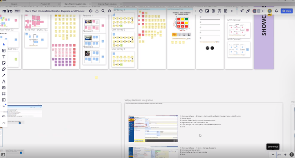
Project Kick Off & Miro Board Creation
For this project, I was incredibly lucky to work with an amazing Business Analyst who was also an ex-vet nurse and a subject matter expert on care plans! I worked closely with her to get a base level understanding of how care plans work from a business/vet clinic perspective, and how they currently work from a software perspective. Along with some other key reps from the product & dev team, together we created a Miro board where we documented current state learnings and brainstormed goals & ideas for the future state of care plans.
The Legacy Product
Below is a screenshot of the legacy product, which I played with & studied to understand what the user’s current experience was like, and to identify areas for improvement. The main goal was to replace this experience with a modern, cloud-based, responsive solution, while maintaining the core functionality & backend data structures from the old platform. Due to scope constraints, we had to keep the existing care plan setup rules & backend structures in place, so it was important for me to gain an understanding of how those things worked in order to respect the given scope boundaries.

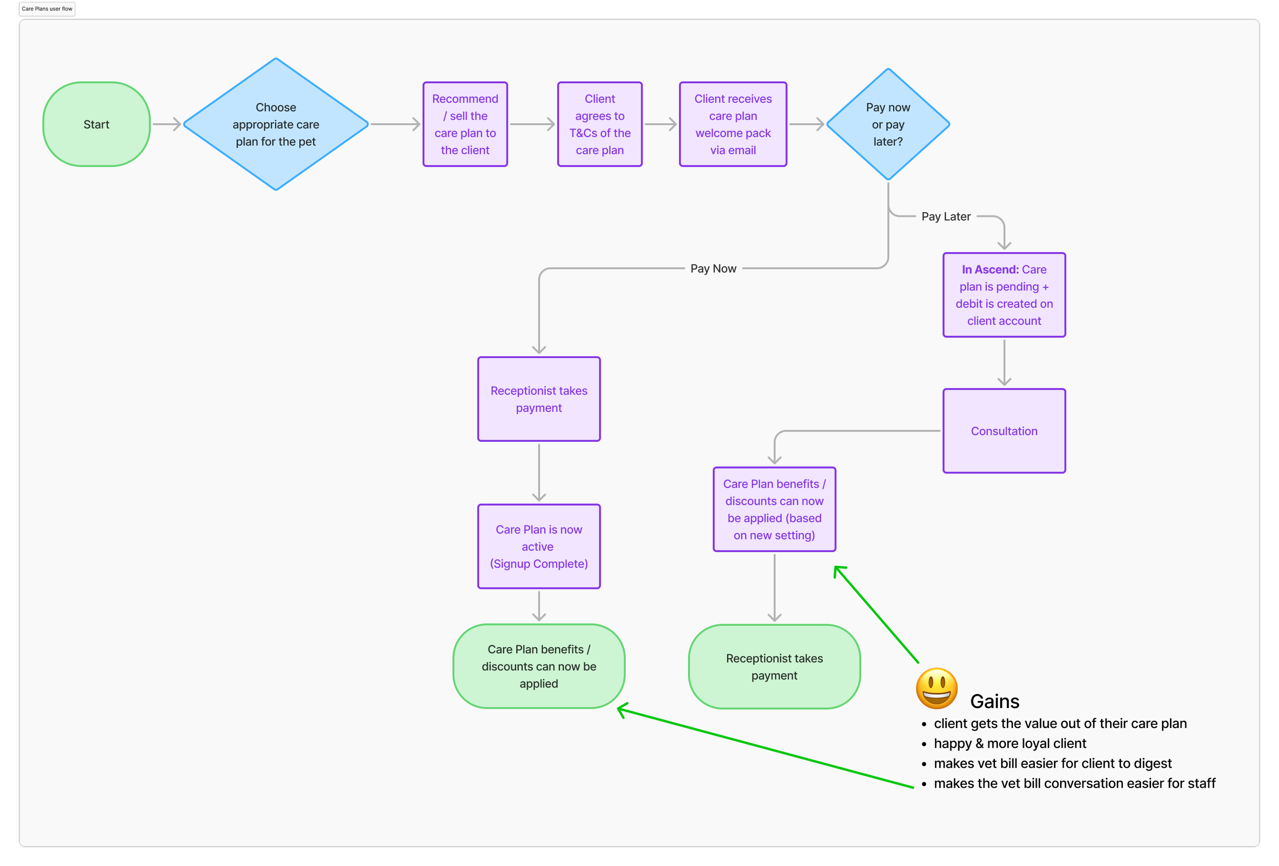
Care Plan Sign Up User Flow
I mapped out the below user flow diagram for the care plan sign up process in collaboration with the Business Analyst. This flow diagram was used:
As a communication tool for internal stakeholders
To confirm/validate current workflows with users
As a basis for starting my initial designs.

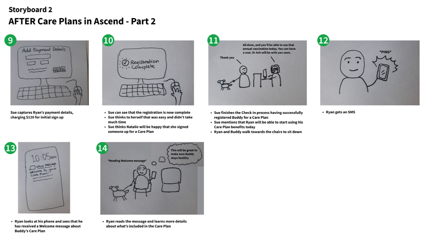
Storyboards & Assumptions!
Based on internal conversations with my team and a user persona the Business Analyst had created, I put together the below storyboards. These storyboards were supposed to reflect a “Before and After” of us solving the #1 user pain point when it came to care plans.
At the time, our assumption was that the #1 challenge was clinic staff feeling uncomfortable about upselling care plans, and feeling unsure about how to recommend the right care plan to the client.
This storyboard was an experiment on my part, which turned out to be a great communication tool for testing our internal assumptions with real users! The “After” storyboard also helped to get the dev team feeling excited about building the future of care plans in Ascend!


User Interviews 🕵️ Testing Assumptions & Discovering Current Workarounds!
As part of my user research, I conducted 3 remote user interviews with veterinary professionals who use care plans in their business. This helped me to test my assumptions, understand their current processes, and learn what they find frustrating about their current experience with the legacy product.
As it turned out, the “pain point” illustrated in the storyboard I had created didn’t resonate with them at all! When I asked “Do you or your staff experience this?” their answer was “No, not really.”
I learned that their #1 pain point was actually how the legacy product forced the user to take payment upfront before allowing the pet parent to receive any benefits from their care plan. This did not suit the real life workflow of the clinics. They really wanted to allow the pet parent to get their care plan benefits right away and then take one smooth payment at the end of the consultation (with care plan discounts applied). Therefore, each clinic had developed their own weird, wonderful & whacky workarounds to make the software behave how they actually wanted it to. 🤪
The workarounds were so convoluted that one practice owner didn’t even allow her staff to process care plan sign ups any more. She explained that letting her team do it had led to too many mistakes, which she would then have to fix; so she gave up and decided to just process all care plan sign ups herself!
As I always say, discovering current workarounds is like a gold mine of opportunity for a UX designer! This got me excited and keen to remove these painful workarounds for the clinics.
Care Plan Competitions & Movie Vouchers 🍿🎟️
From the user interviews, I also learned that 2 out of the 3 of the vet clinics I spoke to ran monthly in-house competitions to see who could get the most people to sign up for care plans, offering things like a movie voucher as a prize! When asked, the clinic who didn’t currently run a competition said they really liked the idea and might start running a comp in their clinic too. This sparked a design idea in my mind later on!
Updated User Flow Diagram
Based on the user interviews, I updated the user flow diagram to reflect more accurately the current experience that users described - that pesky workaround was a real pain point for them!

A side note on why it’s important to include devs in user research
TL;DR version: It leads to more user-centric product decisions, it makes the work far more rewarding, and devs actually do care about this stuff as long as you present it in an interesting way!
Detailed version:
I’ve noticed some people tend to assume that software developers don’t care about the context or business value of what they are building; whereas I’ve found the exact opposite! The devs I’ve had the pleasure of working with have been very engaged in learning about the “why” and the “who” behind the features they’re building. It makes the work so much more rewarding for everyone involved when you’re clear on why you’re doing it, and who you’re doing it for. In fact, many times the devs have asked me thoughtful questions about the end users which I then realised I didn’t know the answer to… When this would happen, it then prompted me to go and fill the gaps in my own knowledge before coming back to them; resulting in more informed & user-centric product decisions!
Of course, for people to be interested in user research you have to MAKE it interesting in the way you present it. Personally, I’ve found that empathy maps and storyboards work, but real photos, videos and user quotes are the most effective.
During the development phase, empowered engineers who understand the end user and business value can also make well-informed product decisions on their own, without needing to ask designers or product managers about every minor decision (e.g. what should the default value for this dropdown list be?).
Anyway, thanks for listening to my TED Talk … Now back to care plans! 😆
Early Design Concepts
One of the early design concepts that I tried out was a personalised care plan recommendation for each pet. This idea was inspired by the “Recommended for you” sections frequently seen in online retail stores. The system would automatically calculate the best fit for each pet, based on their breed, age, weight and visit frequency. I thought this would help to reduce cognitive load by presenting them with the best option for each pet upfront instead of presenting all the options.

❌ Why it didn’t work:
When I presented this idea in design feedback sessions, users asked:
“How do I bypass this recommendation in order to manually choose a care plan?”
Upon further discussion, it became clear that there is more nuance to recommending an appropriate care plan for a pet than I initially thought. There are so many variables which can go into the decision making process of choosing the best care plan for a pet, including a vast array of medical conditions etc. Veterinary professionals go through years of medical training for a reason, and they felt much more confident selecting a care plan based on their own knowledge, rather than taking a recommendation from a piece of software.
Based on the user feedback received, I changed my designs to focus on presenting the user with the available care plans to let them choose.
Design Feedback Sessions
Throughout this project, I ran fortnightly design feedback sessions with a small group of users to continuously validate and iterate upon my designs, taking on board user ideas and suggestions along the way. I also ran weekly design sessions with the product & dev teams, to provide an opportunity for collaboration and feedback regarding feasibility and viability of the designs.
Resolving the #1 Pain Point / Workaround
The thing that was the #1 pain point for a lot of APAC vet clinics actually turned out to be designed that way for UK vet clinics. By collaborating with a Product Manager from the UK team, I learned that UK clinics are generally more strict about requiring payment upfront for their care plans, before providing their pet parents with benefits/discounts. This meant that we could not completely remove this behaviour as it was needed to support UK clinics. There was also exceptions to this rule in both regions (e.g. Some Aussie clinics still required payment upfront, and some UK clinics didn’t).
With this in mind, it was clear that the solution needed to be flexible to support both care plan models across regions. Therefore, I designed a simple new setting. This gave clinics the flexibility to make care plans work according to their preferred model, thus removing the #1 user-reported pain point & workaround for APAC clinics.

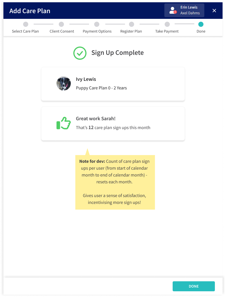
Healthy Competition! Incentivising Sign Ups
From talking to users and learning about their in-house monthly competitions (to see who could get the most care plan sign ups to win a prize e.g. a movie voucher!🍿🎟️), I designed the below.
After completing a care plan sign up, the user is presented with a green thumbs up icon and an encouraging message, giving them a sense of satisfaction, helping them track their progress and incentivising them to get more sign ups. This design was a real hit with vet clinics during design sessions; generating a sense of excitement and healthy competition among clinic staff! 🥰
⚠️ Challenges
Due to scope constraints, we had to build off the existing care plan rules and backend structures set by the legacy software, so I didn't have complete freedom over the user experience.
🤓 Learnings
Lesson #1: Always, always talk to your users to find out their real pain points instead of going off internal assumptions. Even when you hear the phrase “We already know our users and their pain points!”, take it with a grain of salt and still talk to your users if you can.
Lesson #2: You can still innovate the user experience without changing how the system is built in the backend. You can do this by changing the user's mental model of the information they see before them; making it easier to understand and more closely aligned with their real-life processes. Perception is everything!
Lesson #3: As I always tell my stakeholders, number of clicks isn’t everything… But in some cases it is relevant, and can be a valuable metric to look for certain design projects (this project being one such example)! 😀
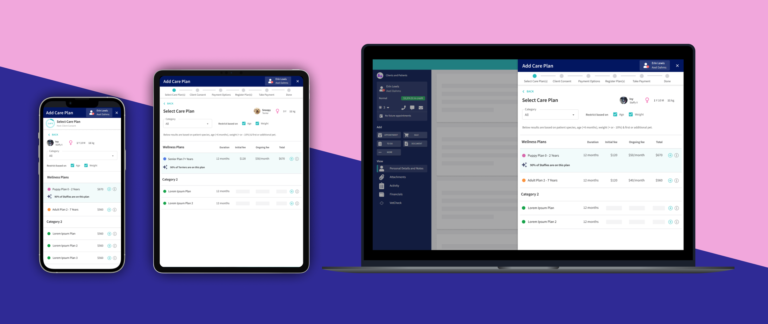
✨ Final Designs
Figma Prototype
🎯 Outcomes
Removed the #1 user-reported pain point from the care plan sign up experience - no more painful workarounds!
With the new simplified process, Practice Owners could now trust their teams to process care plan sign ups themselves - relieving stress & workload from busy Practice Owners
Over 400 care plan sign ups processed within 6 weeks of launch
Over 1700 care plan sign ups processed in 2024
Successfully iterated the designs based on real user feedback
Reduced average single pet sign up process from 11 clicks down to 6 clicks
Reduced average 2-pet sign up process from 17 clicks down to 11 clicks
Removed 100% of click-backs to legacy product for care plan sign ups
What are users saying about it?
“With the new care plans I can now trust my staff to handle sign ups without worrying about them making a mistake or having to do it all myself. It saves me time and is a weight lifted off my shoulders.”
Michelle
Vet Nurse & Practice Owner
“What you have designed would literally remove about 90% of the help desk calls I receive from clinics about care plans!”
Krystal
Tech Support Specialist for Vet Clinics