
Veterinary Digital Hospital Whiteboard
Summary
My Role
Solo end-to-end UX UI Designer
Product
Ascend (Cloud Veterinary Practice Management System)
Project Background
Veterinary clinics have different processes and workflows for managing outpatient and inpatient visits. An example of an outpatient would be a pet going to the vet for a quick vaccination appointment. An animal becomes an “Inpatient” when they get admitted for surgery, or to hospital for severe symptoms to be monitored and treated. Inpatients typically have a longer stay in the vet clinic, and require more specialised care. For inpatient visits, the pet parent will usually drop the animal off at the clinic, and return to pick up their animal after surgery or hospital treatment is complete.
Users
Vet Receptionists, Vet Nurses, Veterinarians
The Problem
There is no dedicated solution in Ascend for managing inpatients (hospital and surgery patients). Currently, clinical teams are using the outpatient solution as a workaround, however the experience is clunky and cumbersome since it was not built with inpatient workflows in mind. Therefore, there is a need for an inpatient management solution to be developed.
The Solution
Provide an elegant and easy-to-use Digital Hospital Whiteboard in Ascend that is responsive across devices. The solution must allow veterinary staff to collaboratively track and monitor inpatients, including their current status and next actions required. The solution should also remove the need for a physical whiteboard in the clinic.
🎯 Outcomes
Successfully eliminated the need for physical inpatient whiteboard in clinic
Successfully eliminated the need for double keying information
Successfully iterated the product based on feedback from beta testing
1174 patients admitted within 6 weeks of launch
Reached 65% feature adoption within 6 weeks of launch (goal was 50%)
Over 68,000 inpatients admitted to the Digital Hospital Whiteboard to date
Link to Final Designs: Figma Prototype
User Research - Vet Clinic Visits
To kick off my user research, I visited 2 local vet clinics to observe and learn about their current workflows and processes for managing inpatients. I learned that many vet clinics are using a physical whiteboard to track the status and treatments required for their hospital and surgery patients. Below are some photos I took of the inpatient whiteboards used at the vet clinics I visited.


Feeling the Stress of an Emergency Case!
These on-site clinic visits helped me to really empathise with the users I was designing for. I was able to see first-hand the stress that one of the veterinary teams experienced when an emergency patient arrived in the clinic. The vets and nurses were under a lot of pressure and had to make quick decisions on how best to stabilise and treat the animal.
(A note for my fellow animal lovers: The patient was okay & became more stable after a blood transfusion thanks to the amazing & talented veterinary team! ❤️)
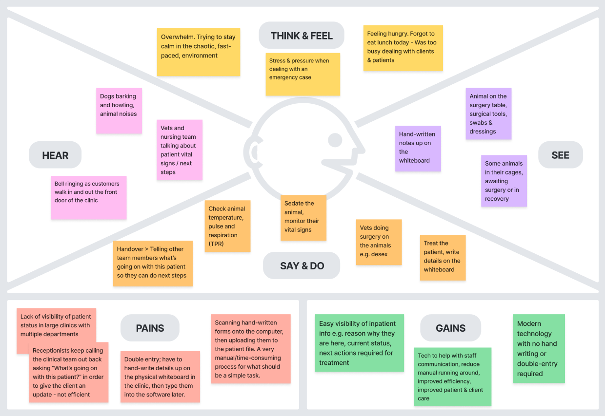
Empathy Map
Based on what I observed during my 2 clinic visits, I created the below empathy map and used it as a communication tool to share user research findings with the developers I was working with. This helped the dev team to empathise & understand what it’s like for vets and nurses to manage their inpatients while working in a busy clinic environment. It’s VERY different to the quiet office or working from home environment that we as a SaaS team are used to! The empathy map also helped to spark motivation, questions and suggestions for potential solutions from the team.
Inpatient Journey Flow
I mapped out the below flow chart of the inpatient journey based on my learnings from the 2 clinic visits and with the help of an awesome coworker who was also a vet nurse! This chart would be used as both a communication tool for internal stakeholders and as a basis for my initial concept designs.

Competitor Research
As part of my research, I had a look at competitors in the digital hospital whiteboard space. This allowed me to understand what features were already out there in the market, so I could see what users might expect as standard functionality from a digital whiteboard.
The Vision 🤩 Initial Concept Sketch
This was an early sketch of the product vision my team and I had collaborated on: A Digital Hospital Whiteboard which would be displayed on a big TV screen in vet clinics around the world! Veterinary staff could update inpatient info using their phones and tablets, which would then be reflected on the big TV screen for their team to see.

Early Design Concepts
One of the early design concepts that I tried out was the ability to mark a patient as “urgent” which would highlight them in red on the digital whiteboard. I thought this feature would be a helpful way to make all clinical staff aware at a glance that this patient requires urgent/critical care ASAP.

❌ Why it didn’t work:
When I presented this concept in design feedback sessions, users responded by stating:
“If an emergency case comes into the clinic, I won’t be bothering to mark the patient as “urgent” on my device; I’ll be focused on stabilising the patient.”
The users whom I spoke to made it clear that documenting the patient’s details is very much secondary to delivering patient care. Only once the patient is stabilised, would a vet nurse then go and take a moment to update the patient details in the software, by which time, the “urgent” status would no longer be relevant.
Based on the user feedback received, I removed the “urgent” flag from my designs, as it was clear that this feature was not useful.
Iteration through Remote Design Feedback Sessions
Throughout this project, I ran fortnightly design feedback sessions with a small group of 4 users to continuously validate and iterate upon my designs, taking on board user ideas and suggestions along the way. I also ran weekly design sessions with the product & dev teams, to provide an opportunity for collaboration and feedback regarding feasibility and viability of the designs.
Beta Testing!
Once I had finalised the designs and the dev team had built the MVP version of the product, I went back to the clinic for some beta testing. It was super cool to see our vision come to life; the Digital Hospital Whiteboard was up on a big TV screen in a real live clinic!


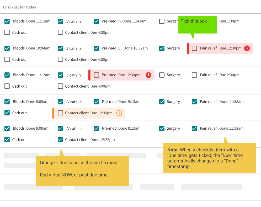
Key Beta Feedback: We Want Timestamps! ⏱️
While on site for beta testing, I observed how the team used the software, and interviewed the vets and nurses to find out what they thought could still be improved. One key piece of feedback that arose was the need for timestamps on the checklist items. For MVP, we had delivered a basic, customisable checklist of actions required for each patient. Common checklist items included things like “Bloods”, “Pre-med” and “Contact client”. During beta testing, there was strong and consistent feedback about the need for timestamps to be recorded against the checklist items. I learned that precise timestamps are particularly important when administering pre-med/anaesthetic to a patient, as the vets need to wait a certain number of minutes for the pre-med/anaesthetic to take affect before they can start surgery.
Incorporating Beta Feedback into the Product
With the beta clinic’s voices in my ear, I went back to the product & dev team and got approval to design some new enhancements. I designed the timestamp feature which was the #1 beta request, along with some other small enhancements. As an agile team, this allowed us to iterate and further improve the product in the next sprint. The result? The beta clinics were thrilled with the new enhancements we delivered, and the timestamp in particular has become a much loved feature! 😍
🤓 Learnings
You can’t design a perfect product upfront! As much research as you do, and as hard as you try, you can never predict some of the things that will come up when the product actually gets used in a real life scenario. Beta testing provided new key insights and user feedback that simply didn’t come up during all the earlier user research and design feedback sessions.
It’s also important to acknowledge that as designers, we tend to get excited about the cool concepts we’ve come up with, and it can be tempting to get attached to those ideas. However, it’s vital to prioritise real user feedback over your personal preferences! If your users aren’t seeing value and utility in it, they’re not going to use it. A “cool” feature is just adding clutter if it’s not getting used.
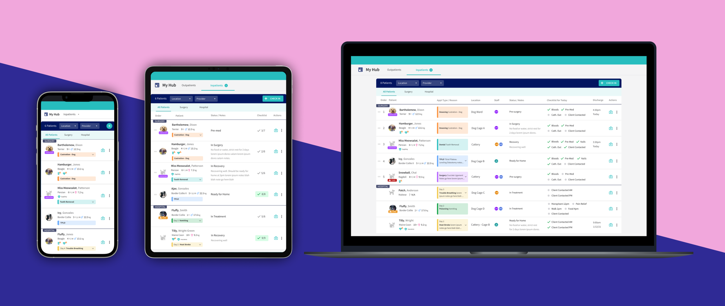
✨ Final Designs
Figma Prototype
🎯 Outcomes
Successfully eliminated the need for physical inpatient whiteboard in clinic
Successfully eliminated the need for double keying information
Successfully iterated the product based on feedback from beta testing
1174 patients admitted within 6 weeks of launch
Reached 65% feature adoption within 6 weeks of launch (goal was 50%)
Over 68,000 inpatients admitted to the Digital Hospital Whiteboard to date


What are users saying about it?
“The Ascend Digital Hospital Whiteboard has completely replaced our old physical whiteboard for inpatients! The team is loving it.”
Dr Kelly
Veterinarian & Practice Owner
“The Digital Hospital Whiteboard is so easy to learn and easy to use. The team was totally comfortable using it within 2 days!”
Jolie
Vet Nurse & Practice Owner