
KPI Dashboard Style Guide
Summary
My Role
UI Designer - I was asked to provide a style guide & help decide where the new KPI dashboard should live within the product.
Product
Ascend (Cloud Veterinary Practice Management System)
Project Background
This was an unusual project in that the development team had already finished building the KPI dashboard by the time I was looped in. I was asked to provide some last-minute design guidance on UI styling and placement of the dashboard within the product. The actual content & data within the dashboard had already been finalised; so changing this was out of scope.
Users
Veterinary Practice Owners and Practice Managers.
🎯 Outcomes
Achieved a cohesive-feeling product experience
The KPI dashboard matches the tone & style of the product
Made a data-driven, user centric decision on where to place the new KPI dashboard
Link to Final Style Guide: Figma Prototype
The Brief
The Product Manager sent the below KPI dashboard screenshots to me, informing me that the development team had already built it. I was asked to provide design guidance on UI styling and placement of the dashboard within the product. The actual contents & data within the dashboard had already been finalised; so changing this was out of scope. I was given a time frame of 1 week.


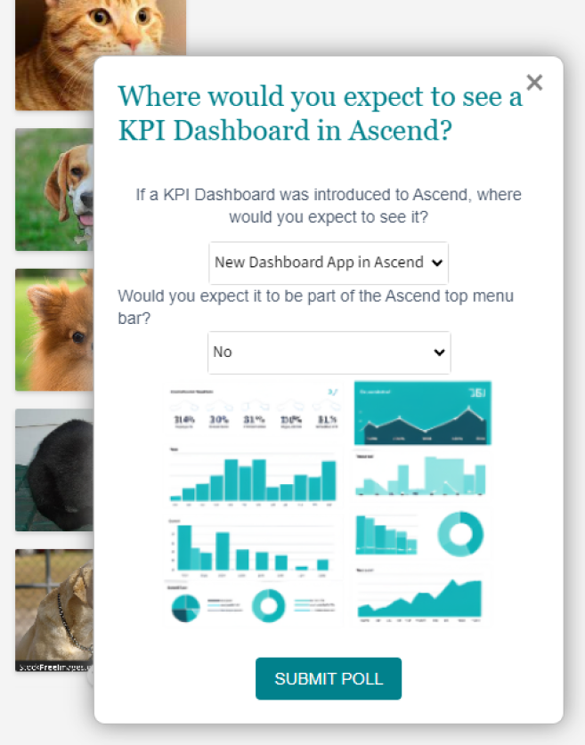
User Survey
To help answer the question of “Where in the product should we put the KPI dashboard?” I ran an in-app user survey via Pendo. I used a Pendo “segment” to gear the survey specifically towards Practice Owners and Practice Managers, who are the target user profiles for the KPI dashboard.
Survey Results
I received 57 survey responses within 1 week which gave me the information I needed to make a decision on where to place the KPI dashboard within the product.


KPI Dashboard Placement
I took the community survey results on board. I advised the dev team to place the KPI dashboard in a new “Dashboard” app (page) within the product, and to leave it out of the top menu bar, as this is what the majority of target users had voted for.

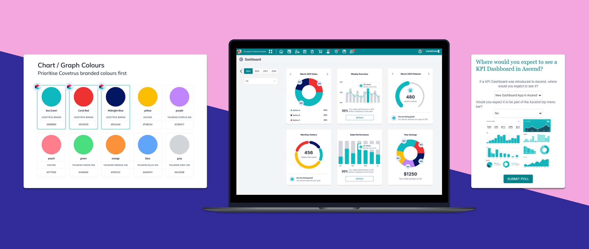
Colours
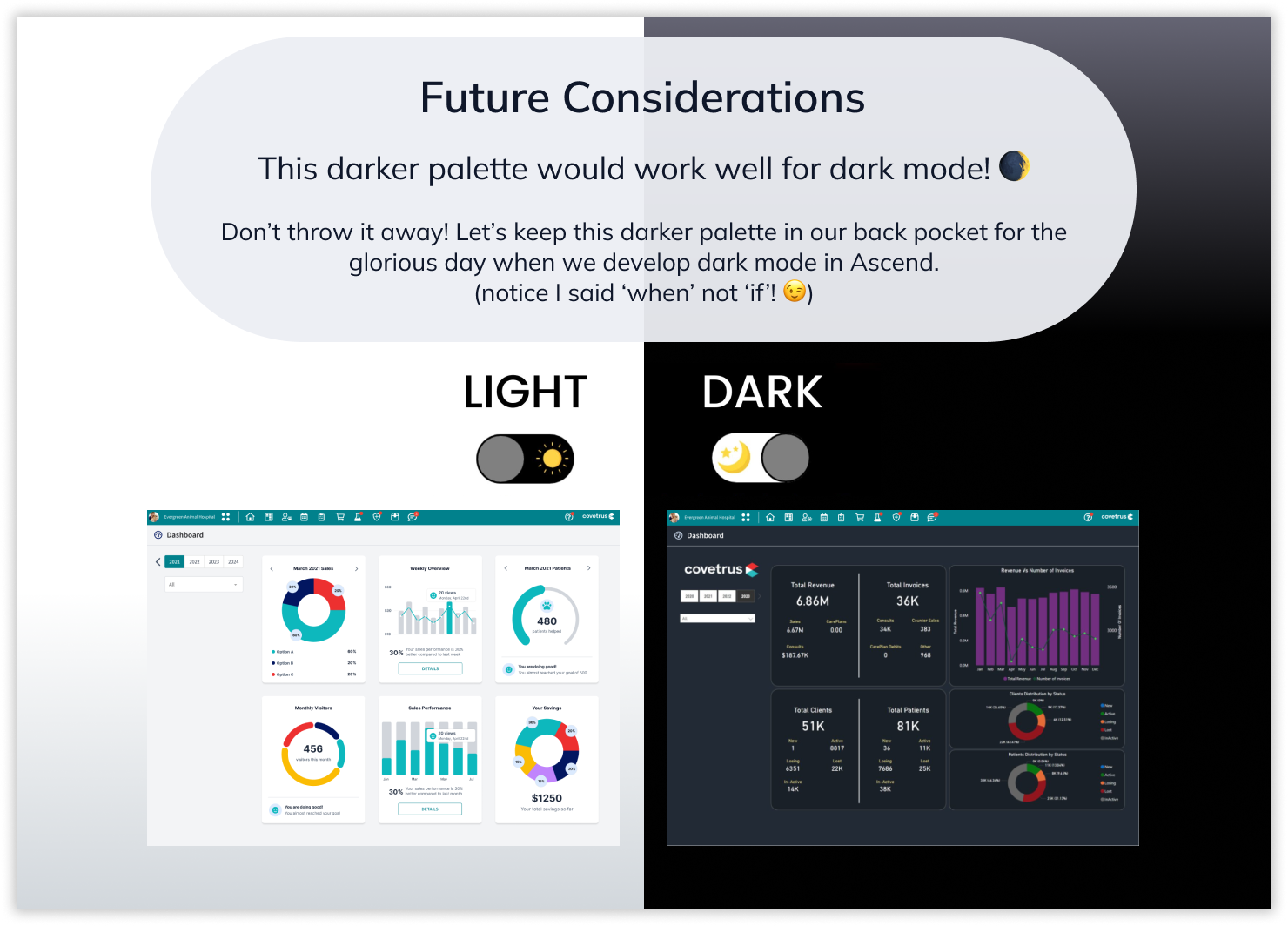
The product in which the KPI dashboard would live already had an established colour palette. The colour palette of the existing product is light and airy, whereas the dashboard the dev team had built was very dark, and did not suit the tone of the product. Introducing a light & dark mode into the product was out of scope for this project (though it was something we were considering for the future). Therefore, I provided the dev team with the below guidance and recommendations on colour scheme.
I provided a simple colour comparison to illustrate why the dark colour palette didn’t work; to give the team some design thinking tools that they could use and hopefully apply moving forward. Give a man a fish and he eats for a day, teach a man to fish… well you know how it goes! 😁


Typography & Other Styling Guidance


Final Handover
Once I had finished putting together my above UI recommendations into a simple Figma prototype for easy viewing, I posted the link in Teams and tagged the Product Manager & relevant stakeholders. They responded positively to my recommendations, and the KPI dashboard was subsequently updated to match my style guide; resulting in a much more cohesive-feeling product experience.
I successfully completed this piece of work within the agreed time frame of 1 week, while also balancing my work on other projects.
🎯 Outcomes
Achieved a cohesive-feeling product experience
The KPI dashboard matches the tone & style of the product
Made a data-driven, user centric decision on where to place the new KPI dashboard
✨ Final Style Guide
Figma Prototype